Our Design Tips for Retail Spaces
Is well known that customers are always looking for stores that are able to sell the products that they need but also are capable of providing a comfortable shopping experience. A well-designed store should feel like a place where you would like to go regularly to check for new items or take your time deciding what’s the perfect purchase.
As your customers enter the store, they should feel a pleasing difference between the outside and the interiors of your business, this is the beginning of the retail experience you provide and is as important as the rest of it.
Make sure that the temperature and lightning invites the visitors to come inside and the organization of aisles and displays doesn’t block or clutters the entrance.
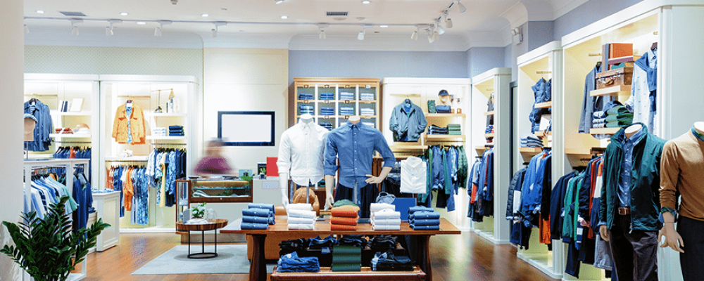
Encouraging a circular path around the store is the best way to display as much products as possible in an organized way. Your customers are more likely to identify all the products you exhibit if you use straight and ample paths, aisles that are too close to each other leave too little space to properly appreciate the products or decide if you want to take them.
Make sure to not create aisles or displays that are too long, creating visual pauses help your customers to see the products you arranged for them. Maybe the way you classify items can give you a clue on how to highlight or separate products in order to make them more desirable or just easier to compare.
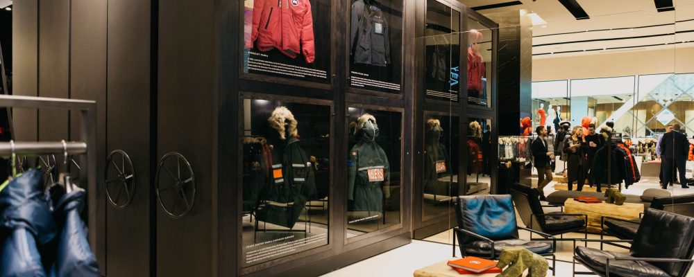
Mirrors can be located in strategic spots that can make aisles feel longer or exhibit areas more spacious, either way mirrors play an important role in light redistribution and product enhancing.
At Canadian Blueprint our designers are ready to take on your retail store project, leave it to us and you’ll get your permit in no time.
